Context
For recruiters, the candidate list is a treasure trove of talent, offering insights into the breadth and depth of available candidates. It serves as a hub for organizing and managing applicants as well as facilitating seamless collaboration among hiring teams.
Problem
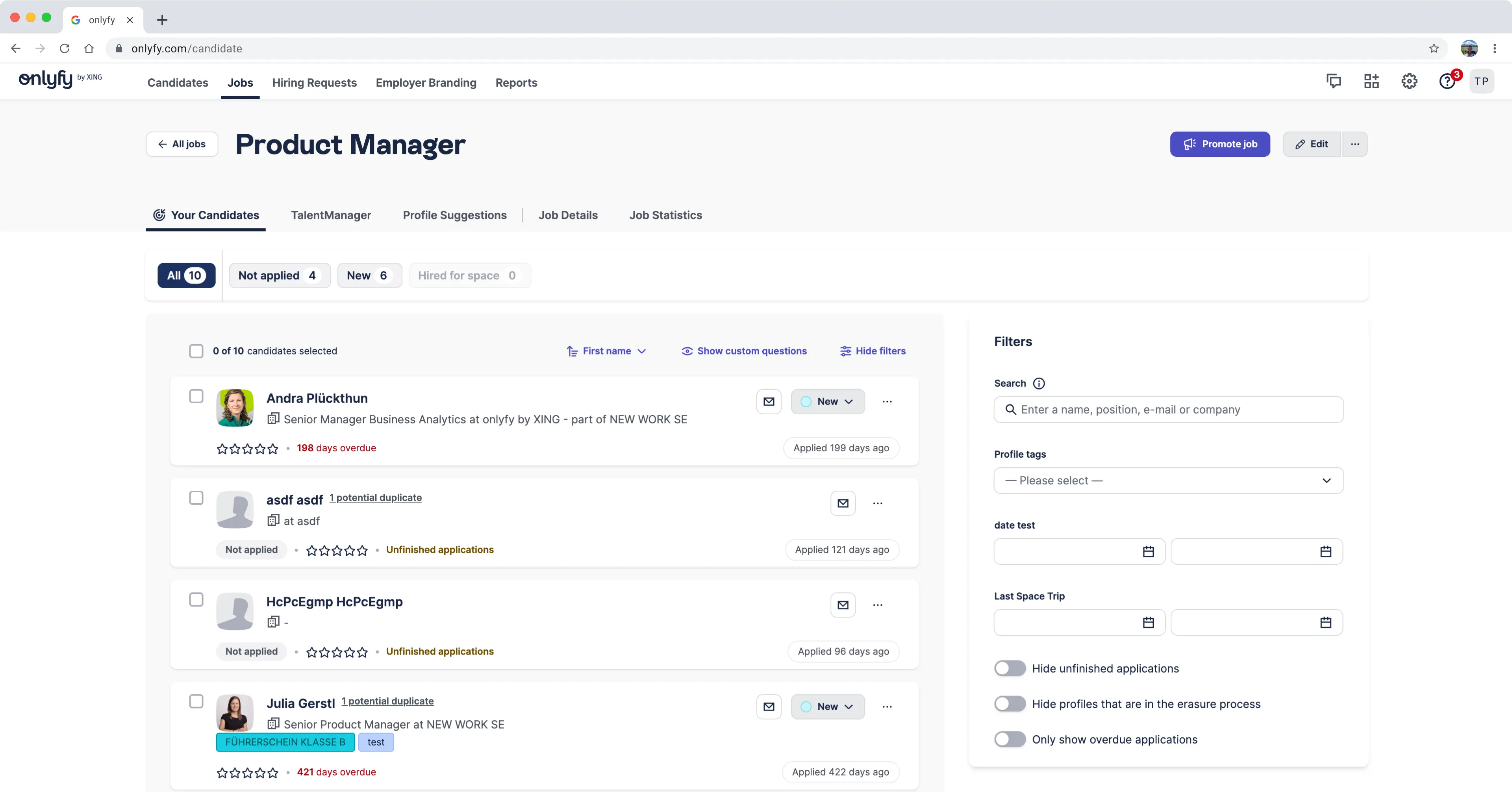
The current candidates list is not very user-friendly. On average, only up to five profiles can be displayed in the viewport at once, making it difficult for users to get an overview or compare different candidates. Since the information is presented in cards, it is hard to scan and offers little customization for the user.
Solution
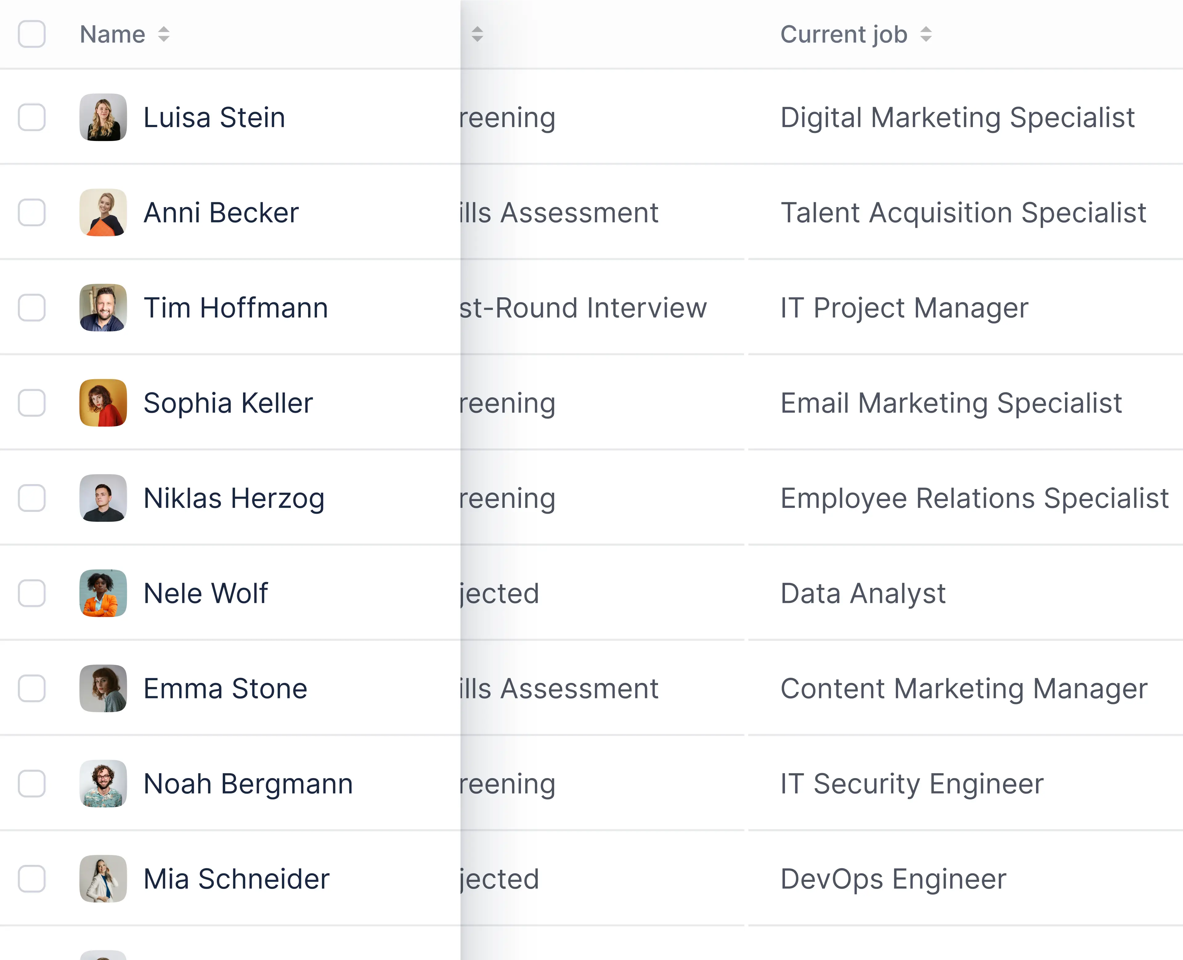
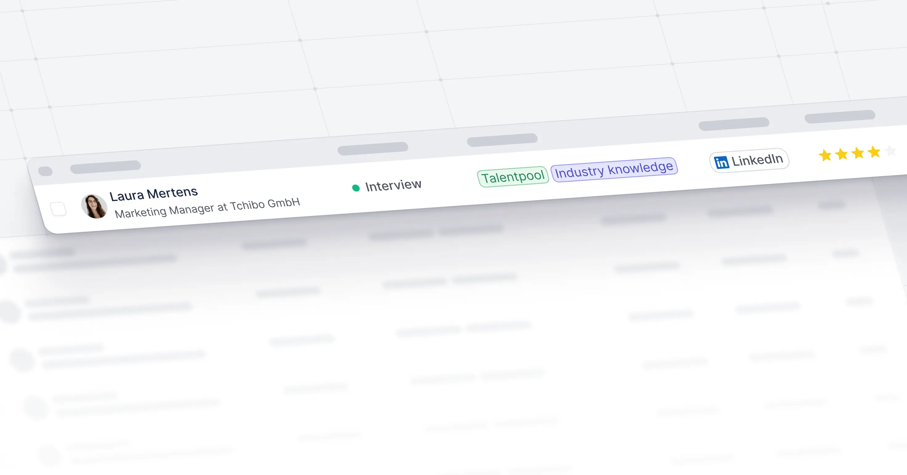
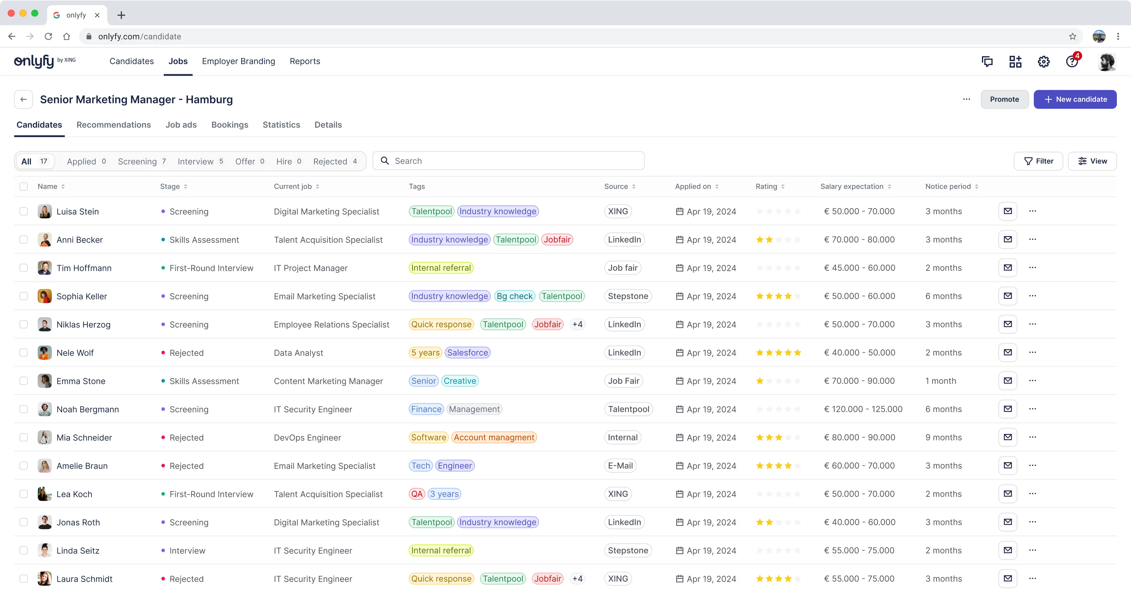
Switching to a table view instead of cards for displaying candidates, which boosts comparability and makes better use of space. Now, we can fit up to 4 times more candidates within the screen, compared to the old layout. Plus, we've toned down the importance and size of the page header, so the table takes center stage and grabs the users attention.
Details
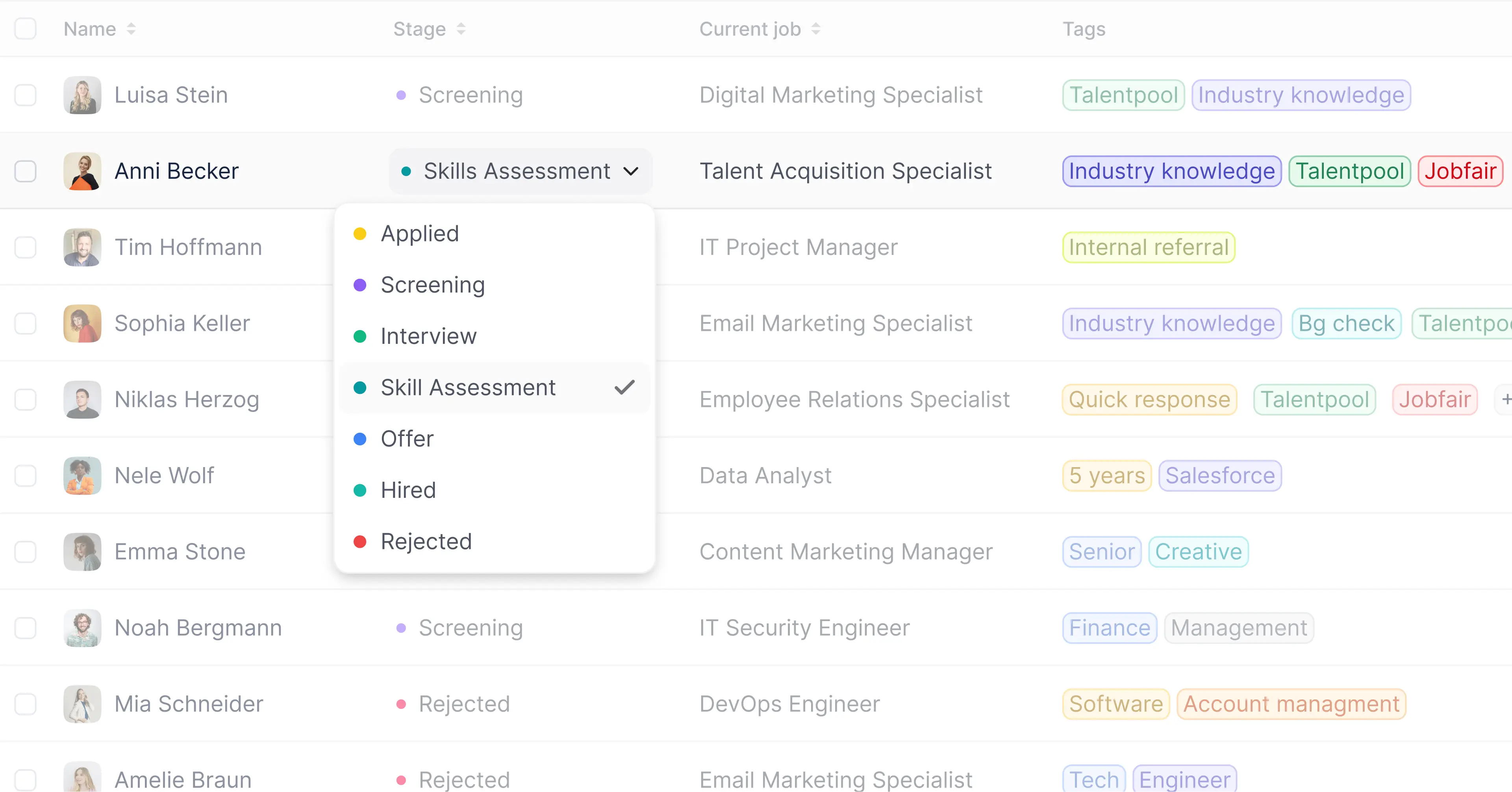
We've implemented inline editing functionalities for certain table cells, allowing users to seamlessly update candidate statuses or add tags directly within the candidates list, eliminating the need to navigate to individual profiles as was previously required.
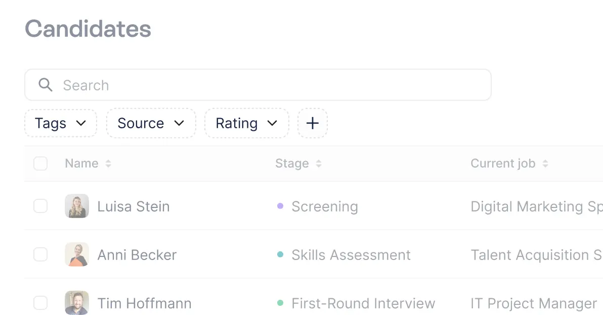
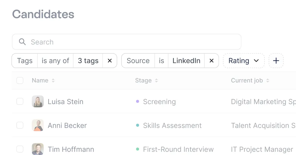
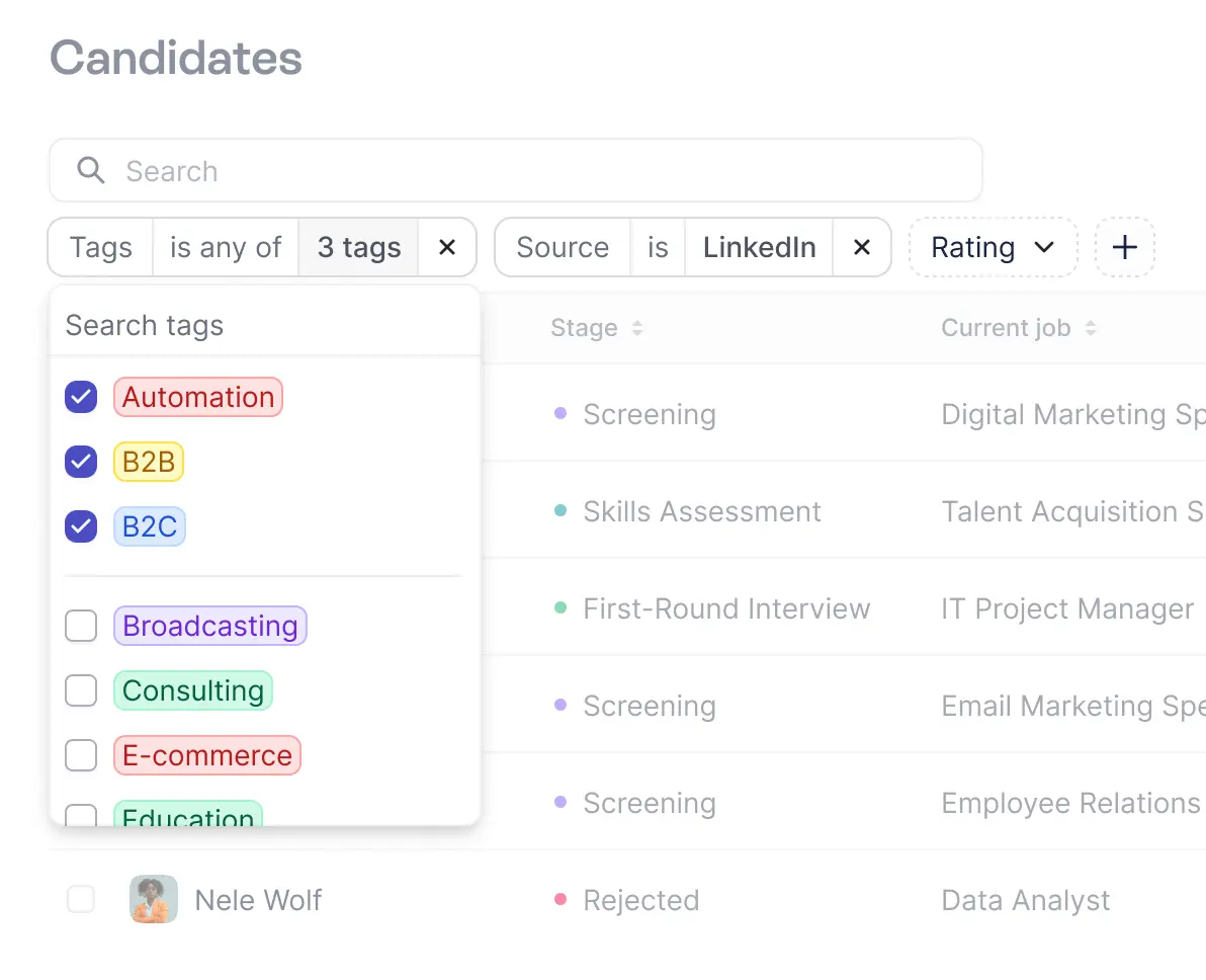
When it comes to refining the candidate list, filtering plays a key role in meeting specific needs, making it easier to consume content and keep an overview of everything. After conducting several user interviews, I found that filtering by candidate status is crucial for recruiters.
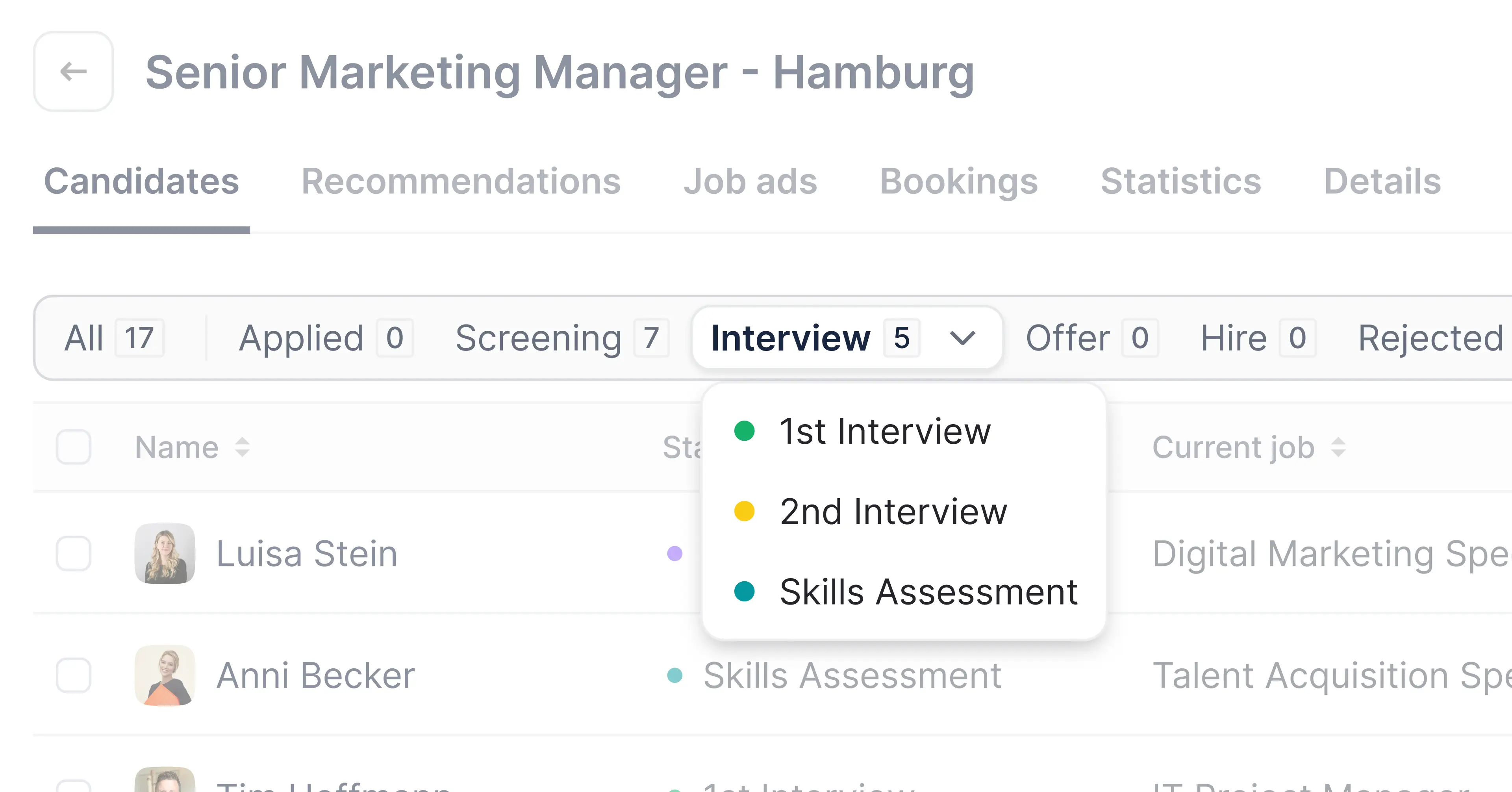
I have made sure to prominently display this feature close to the actual table, providing clarity and a sense of control. Additionally, I have introduced a two-tiered approach to candidate status. Clicking on the tab once, filters the list by the main categories (such as sourced, applied, interview, etc.), giving you an overview of candidates in each category. Simultaneously a dropdown reveals sub categories, which can be defined by the recruiter, to enable an even more granular view.
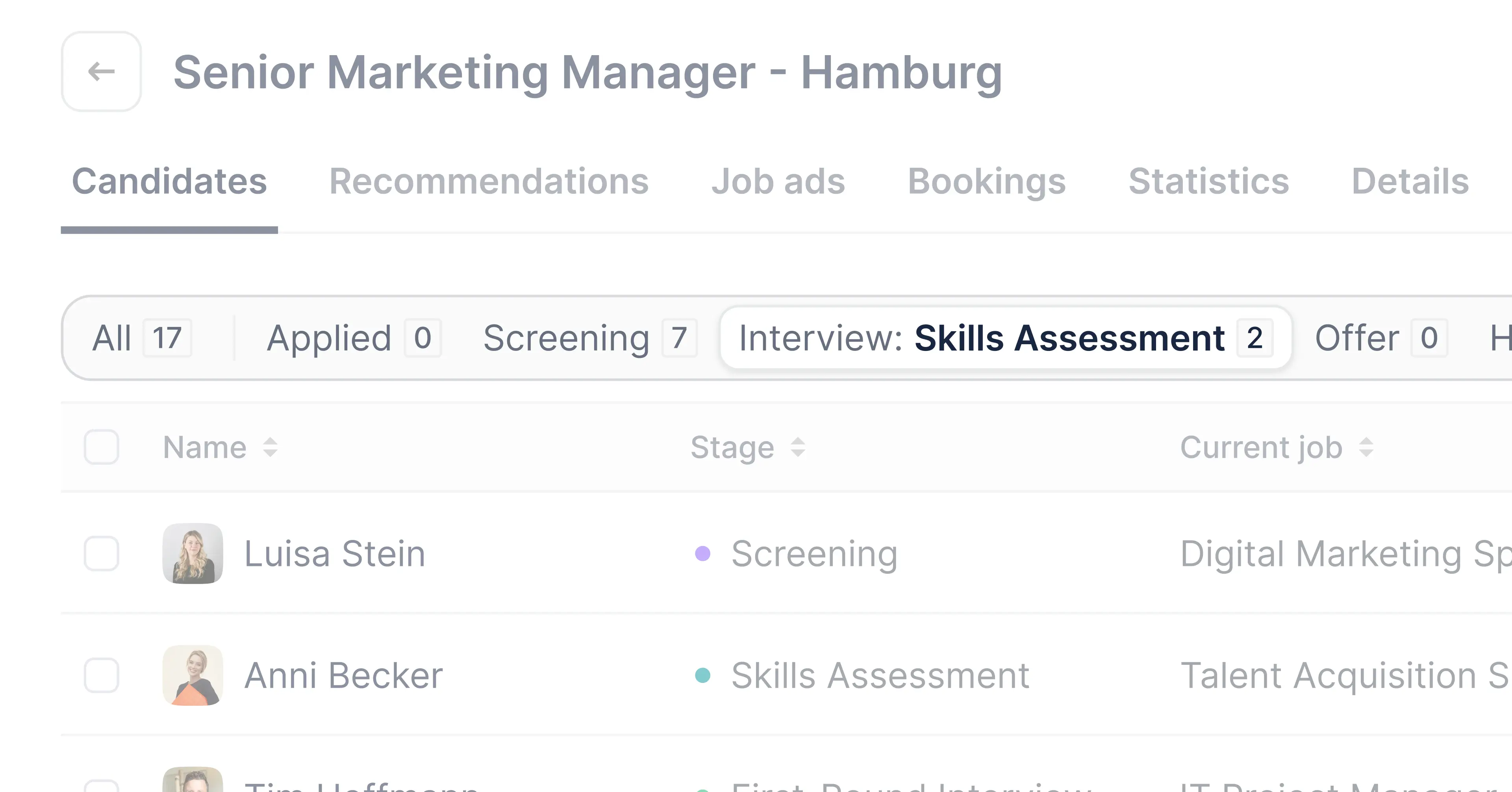
Beside the status filters I decided to hide the additional filters behind an interaction. Mainly to keep the interface clean and dense but also because those additional filters are connected to the status filter, so changing the status automatically resets the additional filters, which could result in a negative user experience if done unintentionally.
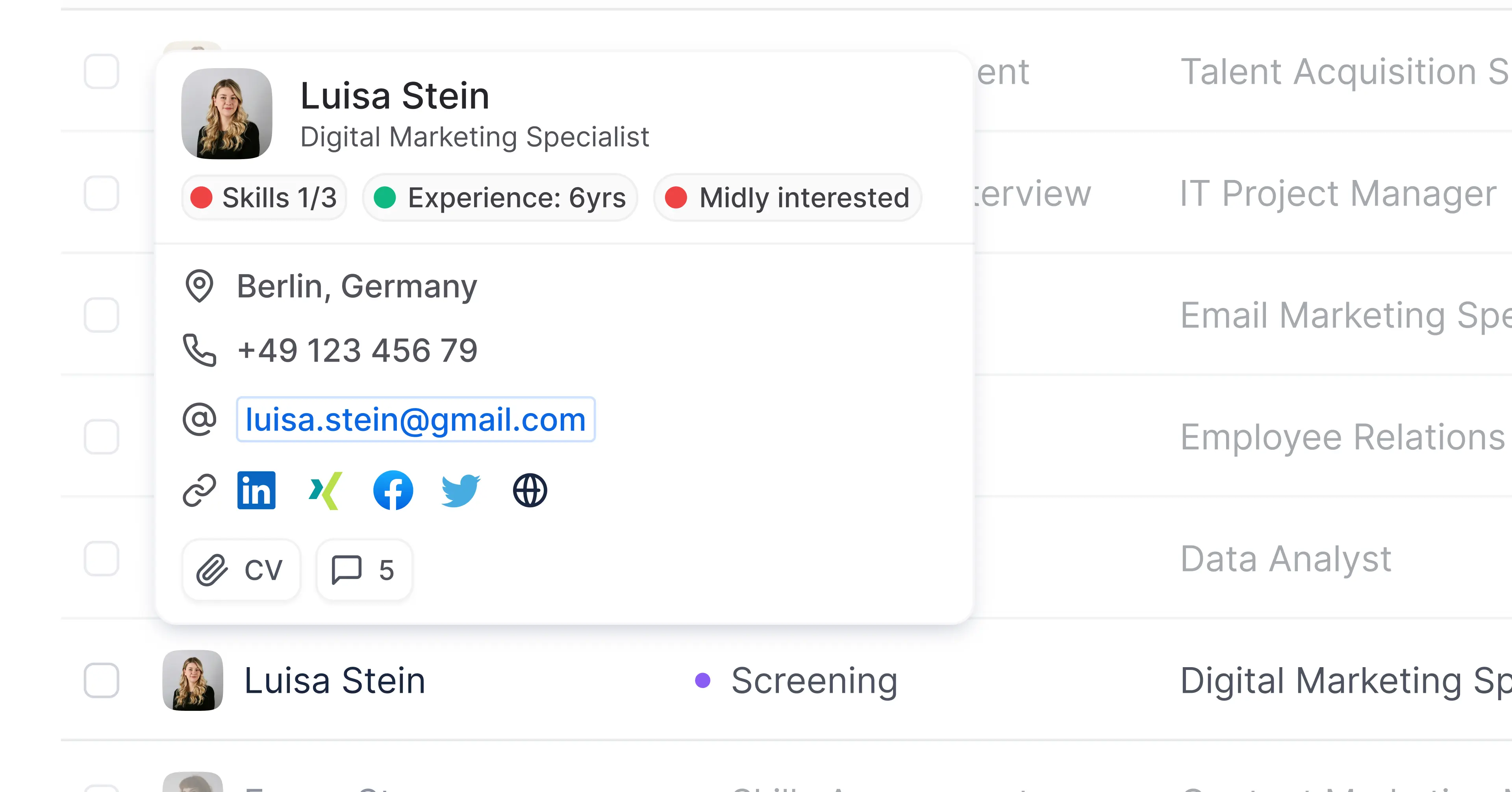
Tables can be jam-packed with info, but I didn't want to overwhelm the users with so much that they’d end up scrolling horizontally forever. At the same time, I didn't want them to miss out on important contact details and other key informations. So we came up with a so called “business card” that opens on hover and holds the most important contact informations as well as a quick summary of the candidate and some secondary interactions.
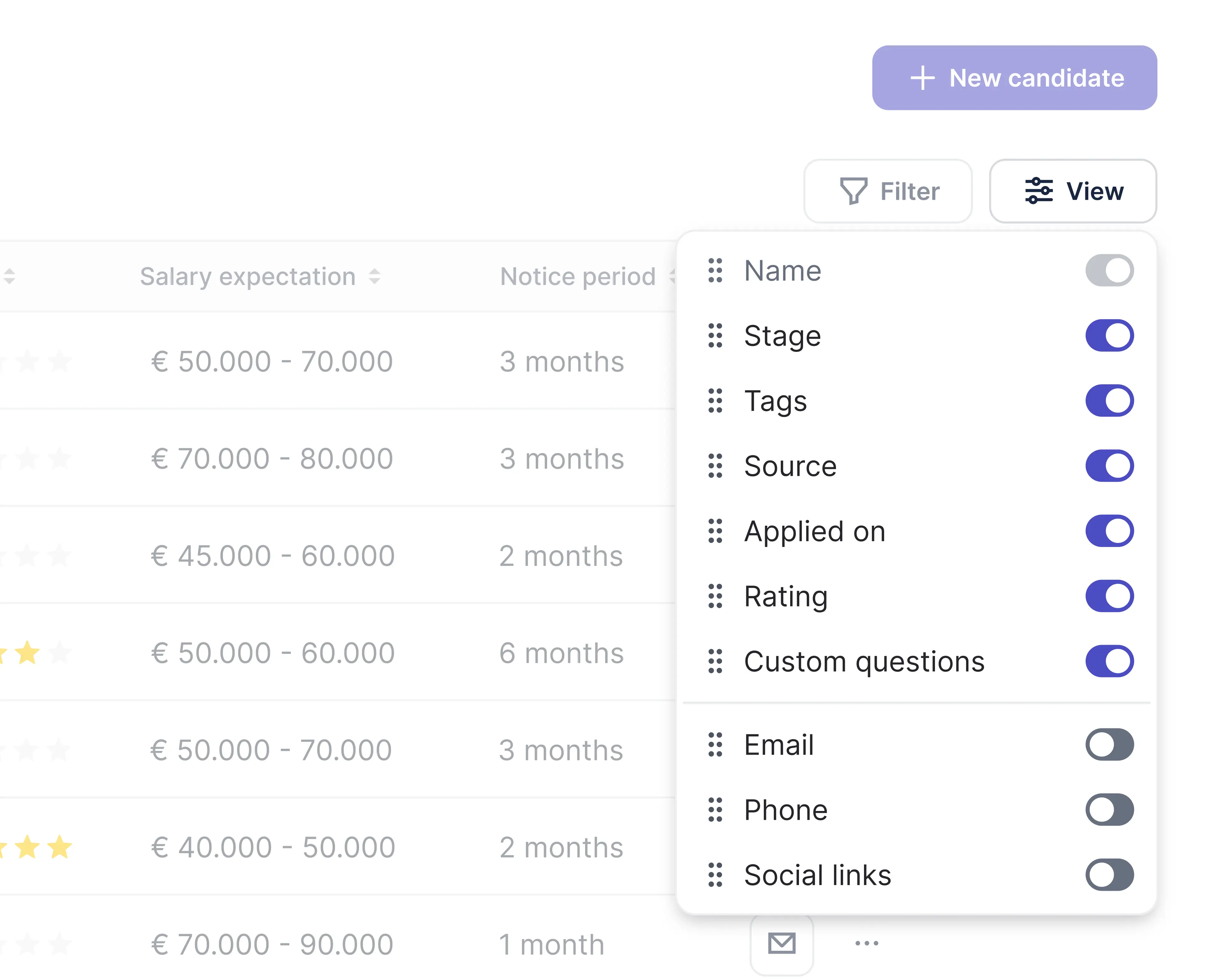
Since the recruiter will be able to customize the table and add columns to it we cannot avoid a horizontal scroll, so we fixed the primary column for those cases so the user is able to keep context while scrolling sideways.
